Behind the Design:
Q+A with Brian Patrick Flynn
We caught up with the do-it-all designer to learn more about his philosophies
and his new collection for Crystorama.
If you didn’t already know, Brian Patrick Flynn is kind of having a moment. The charming television producer-cum-interior designer has designed indoor and outdoor spaces for HGTV’s Urban Oasis® and Dream Home®. He founded his own production company, Flynnside Out Productions, producing lifestyle content with his characteristic wit and whimsy. And he’s recently designed a tailored, eclectic collection of lighting for the fashion-forward lighting brand Crystorama.
He’s the boy next door, if you happen to live next door to a TV producer-host-designer-blogger who does totally regular things like hosting home giveaway shows and getting married on an iceberg in Antarctica.

We caught up with Brian to find out more about what moves him and his designs.
What was your overall inspiration for your collection for Crystorama?
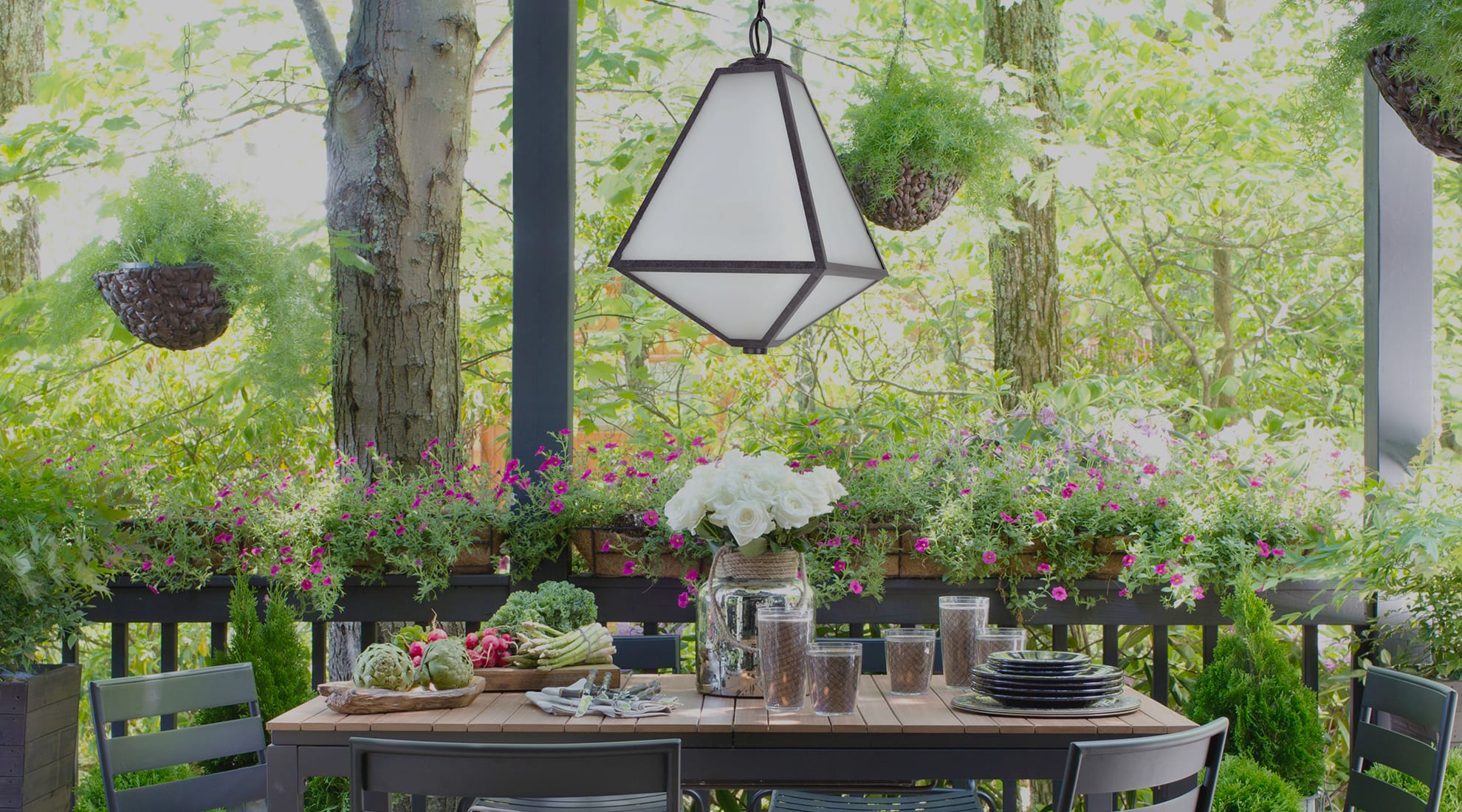
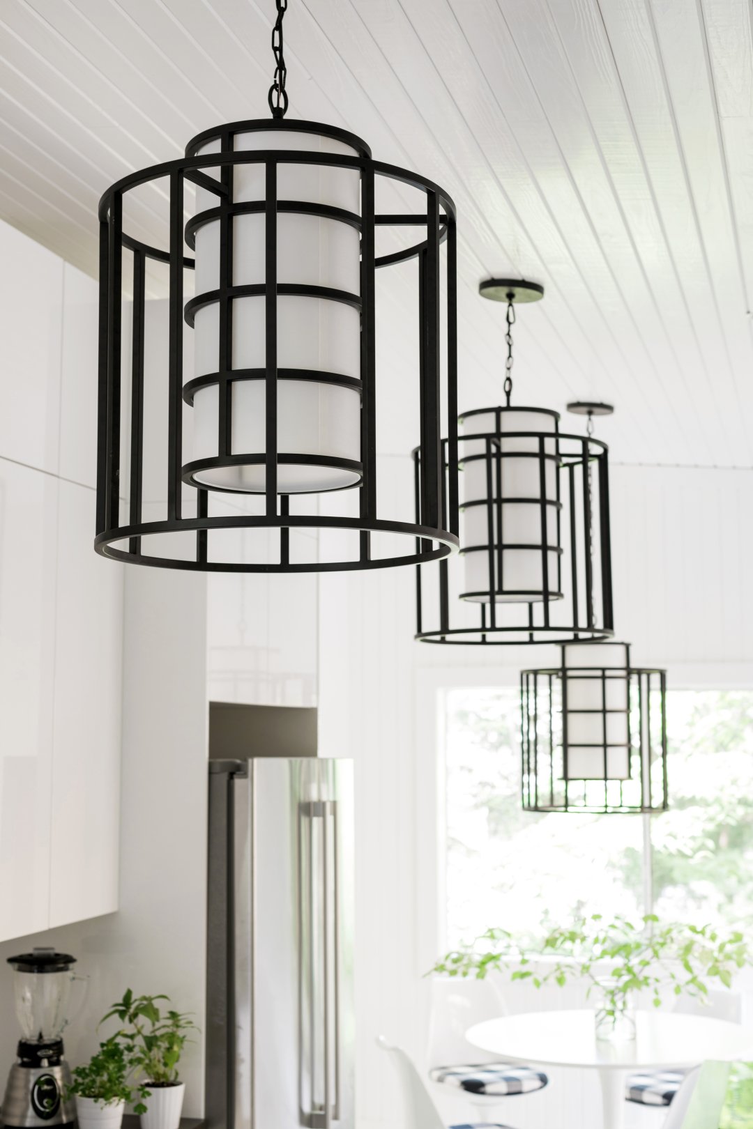
With my outdoor line, I really wanted fixtures that looked like they belonged indoors but were surprisingly made with materials to withstand the elements and came in graphic shapes with dramatic finishes. The overall inspiration was my adopted country of Iceland, with its glaciers, matte black basalt cliffs, the riveted construction of all of its whaling ships that go back and forth to neighboring Greenland, the pristine icebergs in the glacial lagoons and the frosty look of its winter skies and lava fields blanketed in snow. You can see this reflected in the shape, icy frosted opaque glass and the volcanic black finish of my Glacier line.
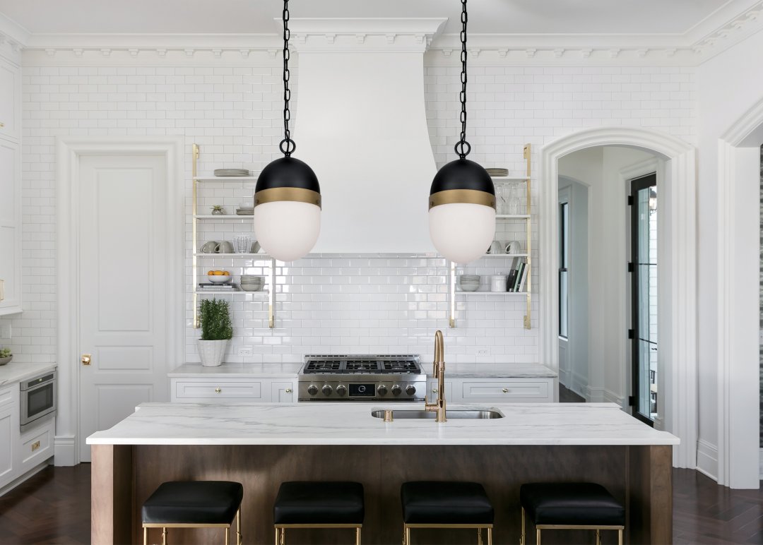
The Capsule collection came mostly because I wanted to play with scale and create a capsule that was slightly widened, almost egg-like, and then offer it in matte black and antique brass with a frosted globe. I see these being a great fit for modern or transitional homes and really helping break up rigid linearity with a fun, organic silhouette.
One thing you’re definitely not afraid of is color. Please tell us more about how you determine your palettes (and trick your clients into seeing color your way).
I'm from sunny Fort Lauderdale, Florida, and growing up I'd seen the same palette over and over again: sunshine yellow, bright teal and tons of terra cotta EVERYWHERE. So bold hues have been around me my entire life.
As I grew up, I kept thinking of different ways to take bold colors and find ways to make them fresh with new pairings: seafoam green with fire engine red, terra cotta with sky blue, deep teal with mustard and light pink. It also doesn't hurt that my formal education is in TV and film production—set design and decoration were my passion—and color is a massive part of successful set design.
So, I would say it's a combination of the two.
There are many different design movements represented across your body of work. Do you have a favorite, and why?
Overall, I'm really inspired by range. Whether it's a designer like Kelly Wearstler who always keeps you wondering what direction she will take next, or brilliant actors who are known for being comedic and then suddenly shine in dramatic or understated roles.
I apply that a lot to my portfolio, and I like the idea of constantly evolving when it comes to furniture styles, color palettes, layered looks versus minimalistic looks, or playing with relaxed and formal styles. When I look back in years, I wanna know that I never got complacent with just one look—by honing my skills, by bringing something fresh to any style architecture or something different to any of my clients' homes.
Your Instagram feed includes a lot of greenery and animals—real and otherwise—in your design portfolio. Can you speak to this aspect of your aesthetic?
While I absolutely adore a pared back, less-is-more, sparsely decorated home packed with gorgeous architecture, negative space, very few furnishings and great light, I cannot help but always want to throw things off a little and make them a little more realistic, as to how most people truly live.
That's why I usually always bring in a few layers of indoor trees and plants, and whenever I can, I try to get pets into the images of my work; mostly because I think pets complete a home. And I also think just a few elements of life set portfolio shots apart from lifestyle shots. I am a big fan of my interiors work falling a little more into the lifestyle world...with people, animals, live goods and just stuff in general in them.
What are the best and worst parts of your major home giveaway television series? What was your favorite moment?
The best part is being able to design something where I don't actually have a true homeowner with his/her likes and dislikes, and this allows me to experiment a little bit more with colors and vibes, etc.
The hardest part is that I am designing homes with the intention of getting as many people as possible to sign up to win them. Therefore, I have to make sure the homes offer a wide range of things for all different types of design lovers: neutral rooms, colorful rooms, eclectic looks, traditional looks, pared back looks, some masculine touches, some feminine touches, kid-friendly elements, pet-friendly elements, indoor-outdoor lifestyle ideas and a wide range of art to appeal to just about anyone. And lemme tell you: That ain't an easy task!
How important is humor in design? Why?
I think every house should have a few moments of comic relief with an element or two which throw an otherwise serious or serene room slightly off or make it memorable in a way that makes people smile. A lot of times I do this with art. I'll commission something totally unique to more or less juxtapose with the opposite vibe the room was intended for.
Anything else to add?
I won a spelling bee when I was 7, so there's that.

