Muuto:A Color Story
With an especially keen eye for distinctive colors and unique materials,
the design team at Muuto finds inspiration everywhere.
With offices tucked away in vibrant Copenhagen, the Muuto design team can't help but be inspired by the urban and natural landscape that has become synonymous with Nordic design. Although relatively new on the scene of Scandinavian design, the brand has its finger on the pulse of good design that is at once on-trend and timeless. Muuto has an especially keen sense of color and material, and we got to wondering where that brilliance comes from.
For Muuto Design Manager, Silke Foged, inspiration can cause a welcomed chain reaction. She loves watching people working inside their craft to do something new, and says this gets her thinking, “Oh, I’d love to see this particular form in that particular color. What might that look like?” This organic ingenuity is undeniably present in Muuto’s subtle yet delightfully surprising color palette.
“Color is at the core of the design process. It’s such a strong influence on how we inhabit and interpret our surroundings.”
Thoughtful and intentional, Muuto’s color schemes take into consideration each object’s surroundings, shapes, textures and atmosphere. “We start by studying the actual product,” says Silke of Muuto’s color selection process. “What context does this product live in? How might a certain color work with that form and surface?” Curious ourselves about Silke’s inherent curiosity in how colors enhance our daily experience, we caught up with the Design Manager to find out what inspires her and the Muuto design team on a daily basis.
Why does color play such an important role in Muuto’s designs?
Color is at the core of the design process at Muuto. It's such a strong influence on how we inhabit and interpret our surroundings. We actually have a design workshop once a year where all the creative departments come together to discuss color and where we want to take our work. Often, we'll assess products we want to see in a new light, and discuss how working with color can help us achieve that.
What inspires the color selection for certain designs?
Personally, my color inspiration comes from everywhere. I can't really control it! Art, museums, theatre, fashion, nature.... I love seeing new ideas and experiments, watching talented people working inside their craft to do something new.
Sometimes this sparks a thought process and gets me thinking: Oh, I'd love to see this particular form in that particular color. What might that look like? And thinking about that sparks even more ideas in turn.
Does sustainability factor into the design process/color story?
Oh absolutely. We want our work as a design company to mean something, have purpose. So we try to incorporate sustainability in our design process as much as we can. That includes our color story. Whenever we're creating a design brief, we include time to discuss sustainability with the designer from the very beginning of the design phase onwards. That way it becomes a natural part of the design, that works with the design. Rather than trying to force sustainability onto the product afterwards.
Has the color story for Muuto changed over the years?
The color story has changed gradually as we've matured. Over the years our colors have become more refined and subtle. Lately we've been working in little splashes of brightness to contrast that and lift the color palette overall.
Between that, and the color exploration in our annual design workshops, we now have a much wider palette that allows for a range of different moods. Rather than being trend-based and doing seasonal collections, or rolling out the same color across all of our designs, we want to carefully curate a lasting color palette. Something that really takes the individual shape and material and function of each design into consideration. The colors we use need to complement each individual piece, to make timeless designs that will live on for years and years.
Tell us about the new color for the Ambit pendant light and how that came about.
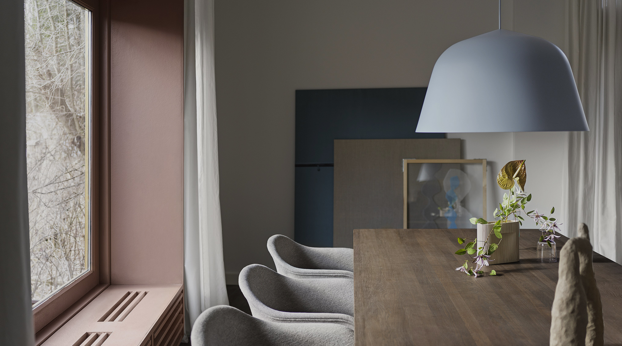
This is a good example of how we try to implement colors specific to a design. Ambit has a very iconic, elegant silhouette, and so we felt that it could pull off a more playful color. The light blue brings a vibrance to the design, but without making too much ‘visual noise’ and it is still incredibly versatile. We find that the light blue works especially well with dark brown wood tones and neutrals—adding a nice contrast and pop of color. But it also pairs very well with whites and lighter woods for a more classic Scandinavian look.
To learn more about what inspires designers across the globe, read more Behind the Design.


