Image courtesy of Pantone
2019 Color of the Year: Living Coral
Another year, another color from the color experts at Pantone. For 2019, the Pantone Color Institute has declared Living Coral the hue of the year, ushering in feelings of optimism and exploration.
Pivoting from the mystical, mysterious Ultra Violet that dominated 2018, Living Coral offers a fresh energy for the year ahead. This lively orangey-pink shade is organic and effervescent, recalling exotic floral blooms, summery sunsets and tropical undersea reefs. Rather than the sophisticated, sensitive purple of last year, this selection is more playful and positive but with a touch of comfort and humanity.
On its own, a bold color like Living Coral can seem too daring a commitment for a home environment. But there are many ways to incorporate the color in more subtle ways. Here are a few ways to take the plunge and incorporate Living Coral in your living room and beyond.
Art & Accessories
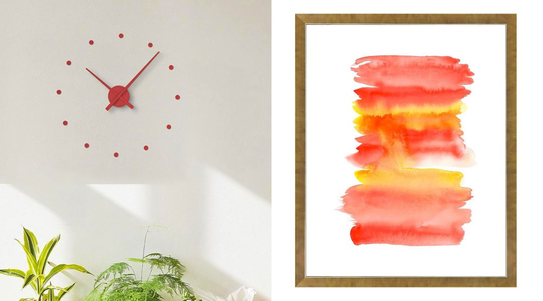
One way to get immersed in color without drowning in it is to add small accessories and artwork to existing decor. Living Coral is a warm tone, so your wall art will work best if your room features similar undertones—think warm woods and natural colors that lean toward yellow or red more than blue or gray. Prints, statement pieces and wall clocks are simple to install and easy to swap out as your taste and trends change.
Indoor-Outdoor Options
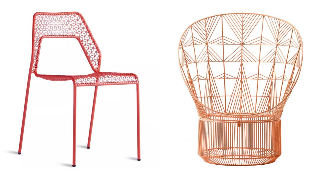
Living Coral is a naturally occurring color, so it’s no surprise that similar shades will look right at home in your outdoor spaces. Look for well crafted pieces that can do double-duty as extra indoor seating, like these fun chairs. When choosing outdoor furniture for indoor use, pay attention to scale and construction so the pieces meld seamlessly with your indoor space and look deliberate.
Indoor Accents
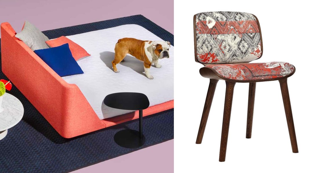
This blushing shade works well alongside the trendy Millennial Pinks and neutral grays that have dominated color stories for the last few years. It’s a particularly cozy shade in upholstery, so don’t be shy when it comes to warming up with cushions, rugs and larger pieces. Because Living Coral is a natural tone that often occurs in human skin tones, you may find yourself seeing the color as more of a neutral in the home.
Mix & Match
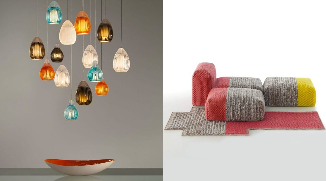
On the other hand, as a purely accent color, Living Coral adds a punch of sweetness and energy among a palette of other shades. Like a coral reef, a huge array of colors contrast with and complement Pantone’s 2019 choice, and it’s kind of tough to go wrong if you approach the color scheme like a living vignette. Blues, greens, yellows, white--there’s almost no end to the possible colorways that will work in any given space, so feel free to mix and match to your design heart’s content.
Colorful Centerpieces
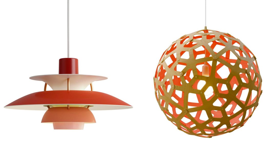
For color purists, there’s no better way to showcase the color of the year than with a show-stopping centerpiece. When selecting a bold design in an equally bold hue, keep focus where it belongs by muting the rest of the room and calling out the color in more subtle ways around the space. Whether lit or not, designs like the PH 5 Pendant or David Trubridge’s aptly named Coral Pendant stand out and demand attention, not only due to their hues but because of their architecturally inspired construction.

Image courtesy of Pantone
In addition to calling the year’s color, Pantone Color Institute offers palettes of coordinating and contrasting tones to help designers and artists envision the color of the year in its best light. A particularly poignant palette for 2019 is Sympatico, which riffs on skin tones found around the world and how they all fit together. Pulling inspiration from complexion undertones, this palette leans into the colors that people use to enhance a healthy glow. Use these tones to create a comforting environment with a human touch, or pull contrasting tones out from one of their other palettes to add interest and balance. There’s almost no end to the possibilities when decorating with Pantone’s selections.

