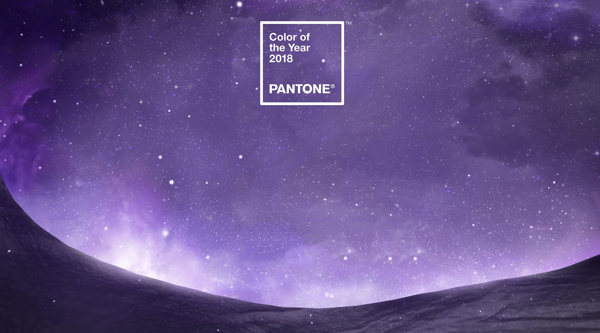
Image courtesy of Pantone
2018 Color of the Year: Ultra Violet
Celebrate in royal style with Pantone's 10th anniversary color-of-the-year selection.
Written by Kelsey Kittle
2018 is the 10th anniversary of Pantone’s Color of the Year, and they’re celebrating in royal style: Ultra Violet leads us into the new year with its blue-tinged blend of mysticism, mindfulness and a touch of magic.
While the Color of the Year is meant to predict trends in fashion, packaging and interior design, Pantone has also used the selections to convey an approach to modern culture. Whereas 2016’s dual selection of Serenity and Rose Quartz reflected an evolving acceptance of fluidity and bipartisan harmony, and Greenery a return to relaxation and reinvigoration last year, Ultra Violet represents ingenuity and imagination.
Pantone’s color experts not only look ahead when deciding the Color of the Year; they also look around. The selection is as much a forecast as it is a commentary on what’s happening in the world around us:
“The Pantone Color of the Year has come to mean so much more than ‘what’s trending’ in the world of design; it’s truly a reflection of what’s needed in our world today.”
On the heels of 2017’s fresh and leafy Greenery, Ultra Violet plunges us into lush, velvety indulgence. A cooler shade of purple, this color plays nicely with other cool tones like navy, charcoal and dove grey to impart a sensitive but grown-up sensibility when used as an accent color. In bolder strokes or paired with brighter hues, Ultra Violet is theatrical and dramatic; the quintessential centerpiece. Here are a few tips about incorporating this year’s choice in your home, from the subtle to the show-stopping.
Accent with Accessories
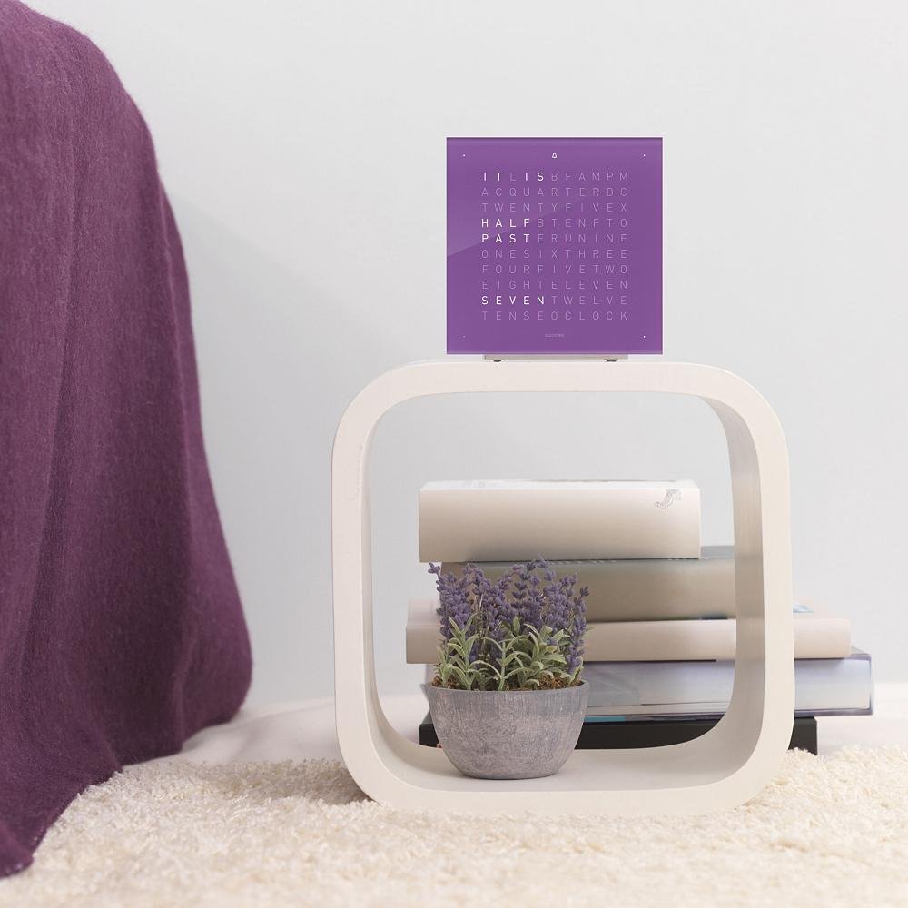
When incorporating a strong, vivid color into existing decor, the simplest route is to use accessories. Any color, however bright or unique, can fit into an existing decorating scheme when used as a small accent. This is particularly true for items that serve a definite function, as the usefulness of that item can even overcome a mismatched palette. For more neutral spaces, adding an accent color is always a simple (and often less expensive) way to freshen up your look without committing to an entire room makeover.
Playful Portables
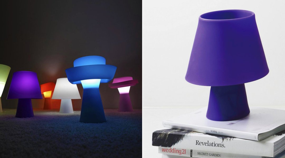
Like accessories, portable lighting can add color and fun without the commitment of a complicated install or room renovation. A battery-operated option like this one can go anywhere, and its flexibility is literally built in—the silicone shade can be manipulated into different shapes. A less whimsical option is a desk or task lamp in your desired shade; there are options to suit all decorating styles, and installation is as easy as finding a free outlet.
Complementary Colors
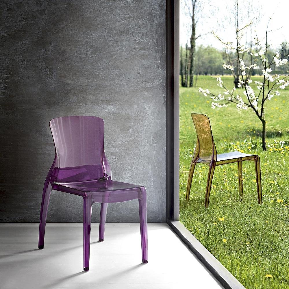
If you’re all about following the trend, but are not so hot on the actual hue, pull in other colors to offset the purple reign. On an artist’s color wheel, purple falls directly across from yellow, which makes them complementary colors. Without a lengthy lesson in color theory, suffice it to say that complementary colors do just what their name implies by complementing one another and creating a pleasant visual contrast.
Since Ultra Violet is a blue-based purple, sticking to yellows that have a greenish tinge will impart a more neutral cast that goes well with bright whites and soft greys, as pictured above. Yellows that tend toward orange will bring out Ultra Violet’s plummier cast and suit warmer accents like beige and ruby red.
Walk on the Wild Side
This color is no shrinking violet, and part of its appeal is that you can feel empowered to make a statement when using it to decorate. Mixing old and new, modern and traditional, classic and bohemian styles is a tried-and-true interior design method that works when careful attention is paid to color, texture and proportion.
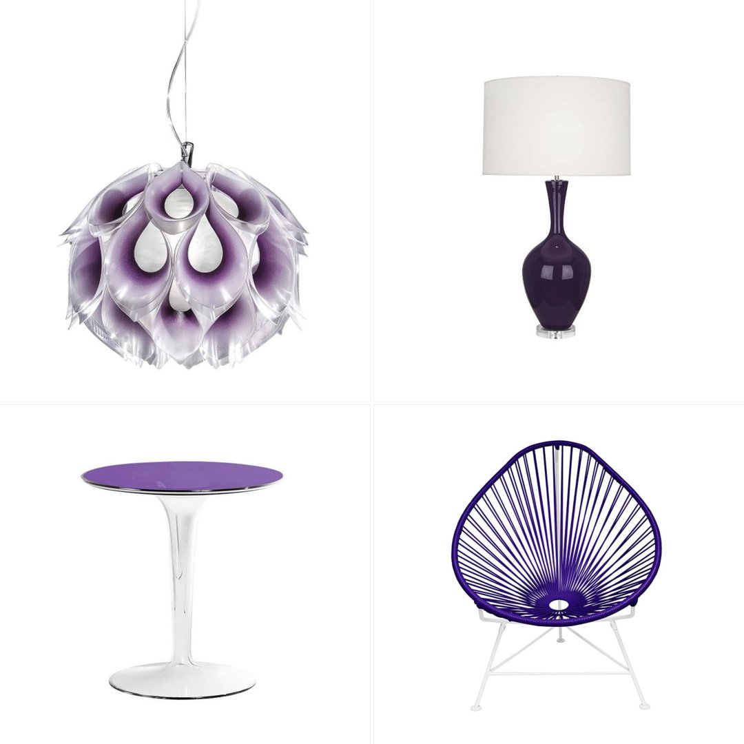
Ultra Violet can be as softly imaginative as billowy crepe curtains, or as in-your-face as a sharp modern pendant and funky chair. Since this year’s color was chosen with ingenuity and vibrancy of spirit in mind, it only fits to incorporate touchable textures, eye-catching silhouettes and unmistakably bold patterns.
Go All In
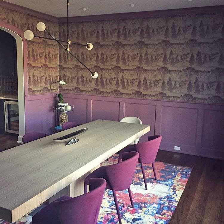
If you’re head-over-heels for this year’s stately shade, let’s go crazy. The richness of Ultra Violet can be tempered with the right neutrals and an eye on visual clutter. In this example, the chairs are bright but they don’t have to compete with the plain, light tabletop. A slightly more subdued wash across the wainscoting is offset with an outdoorsy print above, the busyness of which is echoed in the playful area rug. Finally, a bare-bones globes-and-stems chandelier lends a minimalist touch to the space that would be overwhelmed by a fancier fixture.
Decorating is all about balance, but there are myriad ways you can arrive at that destination. Ultra Violet promises to spur imaginations and spark visionary ideas to guide us through the next year and beyond.

